Tuesday, 26 May 2009
Final
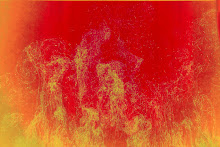
I updated the site with new manipulated images. The html does not show the original pictures so I created another slideshow which would show all the images at a time so the viewer can see the transformation and manipulation together. The reason why I didn’t add all the images to the html file is because I was short of space and it ruined the layout.
Tuesday, 19 May 2009
Portfolio
I have been working on the site, been fixing the layers and text. This is not my main portfolio site so it only consists of one project. Other projects can be found at www.nimrajavaid.com . I have added a link to this site in there.
Tuesday, 12 May 2009
Manipulating
During the week I spent time matching the old and the new pictures using Adobe Photoshop layer’s option. At this time of my development stage I’m very confused about how to present my work. I don’t wish repeat a style in my work but want some quality work. Something I would like to see and admire.
Again I went out during the weekend to take more pictures. Spent the whole day getting lost and finding just a few decent ones. As long as I end up with 15-20 matching locations, they are enough for me to work with. I think after today I will require at least 2 more days’ trip to retake more pictures.
Again I went out during the weekend to take more pictures. Spent the whole day getting lost and finding just a few decent ones. As long as I end up with 15-20 matching locations, they are enough for me to work with. I think after today I will require at least 2 more days’ trip to retake more pictures.
Friday, 8 May 2009
Taking Pictures
First day of taking pictures didn’t turn out too good as I thought I knew the places and just went out without any map trying to find the exact spots. Though I sorted pictures out and labelled them in a pack but finding a place in an area I once lived in seemed impossible. I ended up walking in circles for hours and only managed to take a few shots. After spending 4-5hrs of getting lost I decided to go home and prepare myself for the next trip.
I printed about 8 maps covering all the location I have noted down and placed every map in a plastic sleeve with the area matching pictures. This made my life a lot easier to find places. Thought I had the maps and the pictures but finding the places required me to use GPRS. Lucky my mobile has free GPRS which helped me and I spent 8 hours going to places and taking pictures. This one day I walked 22,820 steps and by the time I got home my feet were hurting me.
I printed about 8 maps covering all the location I have noted down and placed every map in a plastic sleeve with the area matching pictures. This made my life a lot easier to find places. Thought I had the maps and the pictures but finding the places required me to use GPRS. Lucky my mobile has free GPRS which helped me and I spent 8 hours going to places and taking pictures. This one day I walked 22,820 steps and by the time I got home my feet were hurting me.
Tuesday, 5 May 2009
Competition
I have been suggested to write a doc based on the Single Project and hand in with the site which would help me get more marks. I happened to find the perfect competition just in time “Digital Manipulation Competition”
http://www.parkstonecameraclub.org.uk/pcc08/Default.aspx?pid=digiman
http://www.parkstonecameraclub.org.uk/pcc08/Default.aspx?pid=digiman
Sunday, 3 May 2009
Glossary
Before going out to retake the pictures I decided to find the places on net by using Google map to see if most or some of them still look the same. I managed to find a where about of the places but pin pointing a spot was very difficult and this is when I realise that 50-60 pictures are just not enough. I needed to do more research which meant going back to the library.
This time around I was very sure of what I wanted out of them folder. I used their index book and browsed through the folder picking out most of the 1980’s pictures. Then I took pictures of those pictures and made sure I kept record of where the places were. I must have gone through 120 folders picking pictures. Some folder came to be no use but in most I found at least 2-3 pictures meeting my requirement. The glossary of the places I covered is listed below:
Box 23 – Docks
East India Docks
Essex Wharf
Gallions Basin
King George V Dock: 1950-1969
1970 -1979
1980-
London Docks
Plaistow Wharf
Prince Regent’s Wharf
Box 39 – Ethnic Groups:
Italian
Jewish
Racism
Box 40 – Health – Public – Cemeteries
City of London
East London Cemetery
Jewish Cemetery
West ham Cemetery
Woodgrange Cemetery
Box 46 – House – Types – Dated
1880-1889
1900-1949
Box 47 Houses – Named houses
East Ham House
Old Gatehouse, Forest Gate
Green Street House
The Hall, Plaistow
Box 49 – Houses – Named House
Manor House, Manor Park
Park House
The Red House
Stratford House
Box 56 – Leisure and Recreation – Theatres and Cinemas
ABC Upton Park
Boleyn
Broadway Cinema
Central Cinema
Coronation Cinema
East Ham Palace
Box 70 Public Buildings (libraries)
East Ham
Forest Gate
Manor Park
North Woolwich
Plaistow
Plashet
Box 97 – Streets
Baragehouse Road
Barking Road
Box 107 – Streets
Claremont Road
Clarence Road
Box 121 – Streets
Green Street
The Grove
Box 142 – Streets
Romford Road
Savage Gardens
Box 159 – Streets
Woodford Road
Woodhouse Grove
Woolwich Manor Way
Box 163 – Transport – Bridges
Connaught Crossing
Connaught Swing Bridge
Groves Bridge/High Street Stratford Bridge
High Street North/Church Road Bridger, East Ham
High Street North, East Ham Station Bridge
Stratford Market Station Bridge
Box 164 – Transport – Rail:
Miscellaneous
Railway Crossings
Railway Engines
Railway Property
Railway Viaducts and Bridges
Signal Boxes
Station:
Broad Street
Canning Town
Custom House
Box 165 – Rail – Station:
East Ham
Forest Gate
Manor Park
North Woolwich
Plaistow
Silvertown
Box 166 – Rail – Stations:
Stratford:
Freight Terminal
Market station
Passenger station
Railway works
Upton Park
West Ham
Woodgrange Park
Box 168 – Transport – Road:
Toll gates and turnpikes:
Abbey Mills
Barking Road
Forest Gate
Romford Road
Trams:
Double-decker open-topped
Tuesday, 28 April 2009
Site's Layout
Throughout the week I have been working on the layout of the site. The gallery of pictures is made in flash rest is all done in Dreamweaver and Photoshop. I changed the layout once as I didn’t like the first one. I have tried to give the look of photography by just looking at the index page. The site itself is smooth and consist a brief of Single Project so the viewer knows what they are looking at, a about me page which tells the viewer a little about me and a forum page, giving an option to contact me. Because the gallery images are based on the work I’m doing for Single Project so I have been spending more time towards Single Project.
Monday, 27 April 2009
Start
I started off with the best place I could think of which was The British Library, got myself a year’s membership and spent a day trying to find books on pictures of Essex in 1980’s. Firstly I wasn’t sure about the titles and when I did get hold of few books names that I thought would be useful the waiting time was 2 days to 2 weeks. I would have waited up to 2weeks knowing the books I would get would have all the right pictures but it was pretty risky. So I decided to visit a local library which was Stratford library. Lucky I found exactly what I wanted from the reference section. I had to make an appointment for me to look through the folders containing the pictures and was permitted to bring a long a digital camera to take pictures of the pictures they had.
After making an appointment visited the Stratford library again and this time I managed to get some pictures. The library containing about 200 folders of pictures cover a very large area. Now the area is known as Newham but in olden days it was a part of Essex. The Library had an index of folders which was very useful and helped me make my notes. I randomly took 50-60 pictures as I was only looking forward working towards 10 of them. While doing my library research I was also doing my internet research. How other people have developed their ideas and their style of manipulation. All of this can be seen in my sketch book.
After making an appointment visited the Stratford library again and this time I managed to get some pictures. The library containing about 200 folders of pictures cover a very large area. Now the area is known as Newham but in olden days it was a part of Essex. The Library had an index of folders which was very useful and helped me make my notes. I randomly took 50-60 pictures as I was only looking forward working towards 10 of them. While doing my library research I was also doing my internet research. How other people have developed their ideas and their style of manipulation. All of this can be seen in my sketch book.
Saturday, 25 April 2009
London Old and New
My Single Project is based on the changes that have occurred in London during the period 1980 to the present day. I will be focusing on a certain part of the city rather than then trying to deal with the whole of London. (As it’s very big) My primary research will be done using resources at my local Library, through reference books. The local library has images of neighbourhood areas and I will be taking images of those images and then going back to the same location to take pictures now. I will be comparing the old images with the new ones.
My influence for this project is an exhibition running at South Bank Centre of Hayward ‘Mark Wallinger Curates: The Russian Linesman’. The Artist did a project which was a video that showed past and present at the same time. Half the screen showed past and the other half present. The old footage was taken from various old films, whereas the new clips were taken now at the same places, with same angle and pretty much the same time of the day. The vast changes of construction and architecture are obvious and there has been a transformation.
My influence for this project is an exhibition running at South Bank Centre of Hayward ‘Mark Wallinger Curates: The Russian Linesman’. The Artist did a project which was a video that showed past and present at the same time. Half the screen showed past and the other half present. The old footage was taken from various old films, whereas the new clips were taken now at the same places, with same angle and pretty much the same time of the day. The vast changes of construction and architecture are obvious and there has been a transformation.
Tuesday, 21 April 2009
Online Portfolio
Second Assignments consists of an online Portfolio, Competition and a Presentation. I’m already doing a portfolio site for Professional Creative Practice so I decided to make a website based on my photography work. I will be mixing Art Practice and Presentation with my Single Project. My Single project is based on Collaboration. How places have transformed in last 29years.
The online competition I found is as following:
http://www.britisharts.co.uk/competitions.htm
http://www.shootexperience.com/
http://www.photographers.co.uk/html/photography-competitions.cfm
None of the competition has a submission forum; one just got to be a member and can enter the competition.
The online competition I found is as following:
http://www.britisharts.co.uk/competitions.htm
http://www.shootexperience.com/
http://www.photographers.co.uk/html/photography-competitions.cfm
None of the competition has a submission forum; one just got to be a member and can enter the competition.
Tuesday, 24 March 2009
Artist's Website 3

Very Apple Style site, loads of space, simple and plain. I like the site, there is not too much of imagery or text but just the formal page with all the content of the site. I think a slide instead of the image in the centre would have been more interactive, but still a very high rated site.
Artist's Website 2

http://www.ppw.uk.com/
Recently I have seen quite a lot work presented through the same style of flash file. Firstly it takes pretty long to load up then when I clicked on some of the pictures they were half outside the window, I just couldn’t view the complete image.

http://www.profero.com/uk/
No ideas why this site is famous but I don’t see anything amazing. It’s a standard site with loads of space empty. No such logo, just a typeface. Limited colour palate with formal text.

http://www.shawnmcdonaldmusic.com/
It’s obvious that this is a personal site, simply because the artist has put his picture at the top centre of the page. Use of soft colours with formal style of font has been used for the page. No such imagery, the only problem I had with this site is the scroll bar didn’t work. I had to dragged the mouse to the scroll bar and then move it up or down, couldn’t use a roller mouse for some strange reason.

http://www.magicsocket.com/
Each and every page of this site is linked to the previous one through the road where the user can play a race. The site is just one long page and that is why the racing game is possible. I played the race, couldn’t win.

This is one of the portfolio sites I came across while browsing to see how other people have presented their work on web. The work is amazing and so colourful. The site deserves a visit.
Artist's Website 1
Links of Artist’s website that I look at

http://www.6beersofseparation.com/
This is a 3D site, very unusual from the standard websites. 1st thing they ask is if the user is over 18 or not. Very limited colour palate but the site has a casual look. Graffiti style has been used on a 3D wall.

http://www.talktofrank.com/basement.aspx
Very dark site, just by looking at the way the site is presented through pictures, user can tell it has something to do with drugs. I guess the images are taken in basement and it has a feel of filthiness and dirtiness. The site has two sets of navigation, one on top and one at the bottom of the page, with some sound when user browses around the page.

http://www.missingink.com/
The logo suits the site name, where the water is dropped on the typeface. White background with black text has been used for the site; navigation bar is set just after the logo. There is nothing so extraordinary about the site but is still come up as one of the best site according to the magazine .net issue 187.

http://www.nanozoom.net/swf/home.html
Timeline style has been used for the site, interesting work, and loads of space at the centre of the page. Dark tones of colours have been used. Personal opinion would be its quite depressing layout and feel with instrumental music.

http://www.otterball.com/
An interactive site, I quite like the format of the site. All the images are links to the sites, which are rather similar if compared. The moved of the images on the page due to the movement of the mouse is the best things about the site. Something new and different.
Tuesday, 17 March 2009
Tuesday, 10 March 2009
The Competitions
The competitions that I have looking at over the internet are all related to photography, as my single project is also based on photography. Here are some of the sites that I have recently visited to find a competition of my preference
http://www.britisharts.co.uk/competitions.htm
http://www.shootexperience.com/
http://www.photographers.co.uk/html/photography-competitions.cfm
http://www.fotothing.com/competitions/
http://www.britisharts.co.uk/competitions.htm
http://www.shootexperience.com/
http://www.photographers.co.uk/html/photography-competitions.cfm
http://www.fotothing.com/competitions/
Tuesday, 3 March 2009
Xing game
During week 4 we played the Xing game, which was about the things that should be taken into account while doing a business, such as strategies, actions, development etc. This was my first time I played the game and thought it was very different from usual games. There was a theme to construct the business from base to goal.


Tuesday, 24 February 2009
How to write Artist statement
I searched through various websites to see the format of how to write an Artist Statement, and the following are the points that I think are answered in Artist Statement
Points to take into before writing an artist statement:-
Points to take into before writing an artist statement:-
- Make "I" statements, rather than "you" statements.
- Talk about what your art does for you.
- Avoid relative remarks that have been made about your art by third parties.
- Always give readers the choice to agree or disagree with you.
- Avoid unclear references to anything else that requires detailed explanation, example music, art and history. If reference is must, explain it fast so that people know what you're talking about.
- Tell the story about what led up to your art only if it's short and really relevant.
Avoid comparing yourself to other artists. - Before you go public with your statement, get feedback. Show your art and statement to friends, and maybe even a stranger or two.
What information should be included?
Though it is a matter of personal choice, but there are a few questions you might choose to think about:
- Why do you create art and what does it mean to you?
- How does the creation of art make you feel? What emotions do you wish to express?
- If the statement refers to a specific piece, why did you choose to represent this piece in this way? What do you call the piece and why? What materials did you use?
- What inspires you? How are your inspirations expressed in your work?
- What message are you trying to convey to the viewer?
- How much time is spent creating your pieces?
- How is your work a reflection of you?
- What artists (living or dead) have influenced you?
- What are your vision/beliefs?
- What are your targets for the future?
- What are your techniques and style and how do these relate to the medium?
- How do your techniques and style relate to your vision/beliefs?
Art statements that I read
Richard Hunt
http://www.richardhunt.us/pages/STATEM-1.html (Read on 18/02/09)
Tuesday, 17 February 2009
WRITING YOUR ARTIST'S STATEMENT- Molly Gordon
How did you get into this work?
Work – I take work as field. How I got into this field was due to the fact I couldn’t enrol into a course of my choice as I was late comer so I selected art and design as my alternative of subject to study.
How do you feel when work is going well?
Feel confident and happy.
What are your favourite things about your work?
The processing stage.
Jot down short phrases that capture your thoughts.
Twist and turns
Last minute changes
Make a list of words and phrases that communicate your feelings about your work and your values.
Include words you like, words that make you feel good, words that communicate your values or fascinations.
Be loose. Be happy. Be real.
Realist, abstract, colourful, open, different, clear, ambiguous, manipulated, deep, dynamic, strong.
Answer these questions as simply as you can. Your answers are the meat and potatoes of your stew. Let them be raw and uncut for now.
What is your favourite tool? Why?
Effects, because it lets me change the subject to how I want it to look like
What is your favourite material? Why?
Material- Application – Photoshop
What do you like best about what you do?
The new look of a design
What do you mean when you say that a piece has turned out really well?
Achieved my targets
What is your favourite colour? List three qualities of the colour. Consider that these qualities apply to your work.
Black- Dark, Hides many things, Obvious
White- Pure, Clean, Smooth
Maroon- Bold, Deep
Write five sentences that tell the truth about your connection to your work. If you are stuck, start by filling in the blanks below.
I begin a piece by thinking about the theme, requirements and criteria.
I know a piece is done when I achieved all the set targets required and the final product is working properly.
When my work is going well, I am filled with a sense of confidence (feeling of being capable of doing good job).
When people see my work, I'd like them to comment, though I would like them to compliment but criticism leave me more room for improvement.
Subscribe to:
Posts (Atom)